As a recruiter, I’ve seen thousands of resumes cross my desk–from classic and simple to creative with infographics. I’m also aware that people utilize resume templates to save time and provide a structure for formatting. This is my take on what I find effective and what you should be thinking about when you seek out a resume template.
Before you type “resume templates” into your search engine, think about your work experience and objective.
Should you pick that colorful, multi-column unconventional template? I work with companies to seek out and identify talent within the creative field, so I have reviewed a higher volume of resumes from Creative Directors, designers, and marketers that choose this style of resume. Even then, a graphic resume is not necessary. Creative elements and style can be demonstrated through a personal online portfolio or supplemental PDF documents.
Content First, Format Second.
“Should I include a picture” “Multiple columns?” “Graphics?”
I hear so much hype around finding the perfect resume template and less emphasis on content. Don’t fret about the format first–the first step in content strategy is to define your goal and target audience. A resume is not an autobiography. Instead, select and communicate your highlight reel so it’s tailored for that job title and company.
Part of this strategy is making sure your content is well-organized and flows with telling your narrative. If you start with a template, you may be tempted to follow a guide without questioning the effectiveness of your message.
While I can’t make a claim it hasn’t happened, an employer or recruiter is not moving you forward to an interview because of your resume format alone. A design may capture the reader’s attention (positively or negatively), but the words you use to communicate your experience, skills, and abilities are going to be what convince the reader that you could be fit for the position.
With that said, I did peruse a few of the resume-building tools including Canva and Resume.io. Here’s my feedback:
Canva
Canva is an online graphic tool. Visually, the templates are appealing–pictures, columns, colors– but I find that distracting. I scanned through hundreds and I was only able to find a handful of templates that were text-based.
➡️ If you choose a resume template before thinking about the content, you may be tempted to plug and play into sections that aren’t relevant to your narrative. (Hobbies, endless skills list/charts).
➡️ Who is your audience? A creative director, CTO, Operations? Even then, I reviewed the resumes of design leaders who did not have a creative or infographic format. 🔗Instead, their portfolio link showcases their visual skills.
Canva templates I don’t recommend
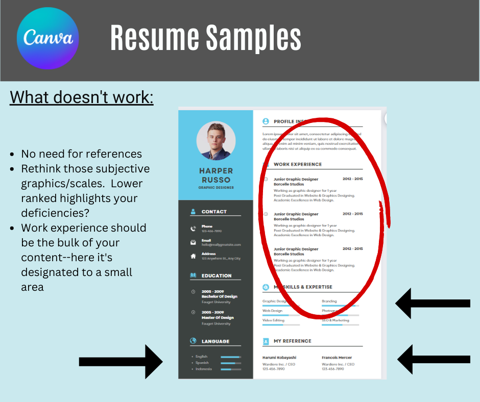
In this example, the amount of real-estate for your experience is around 25%.
Visual scales of expertise have been trending, but I find them subjective. Your 4/5 is not equivalent to their 4/5, is it?
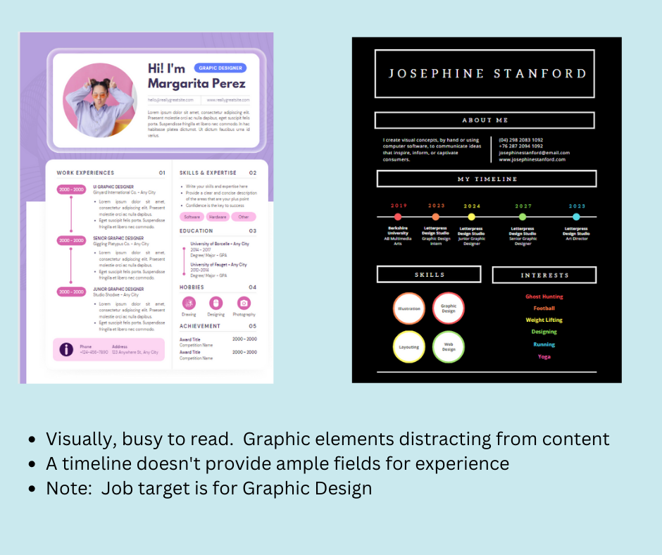
Should you include a headshot on your resume? In Canada, the US, and the UK, it’s generally not recommended due to avoid bias in the hiring process. The opposing argument is that an employer could seek out your picture through other means, like social media, but leaving a headshot off can keep the focus on the content.
On the right, I found both templates to be hard-to-follow and visually distracting. Both job targets are designers, I might add.
What Canva templates I do recommend
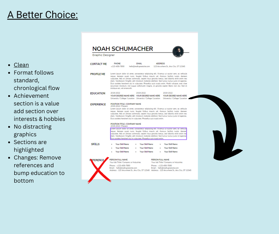
This format is clean. What does that mean to me?
*Limited use of graphics (except headshot #delete)
*Standard, Chronological formatting. Functional or combo should be used less frequently. Breakdown of differences here.
*Use of white space
*Resume sections are highlighted and consistent throughout the whole document
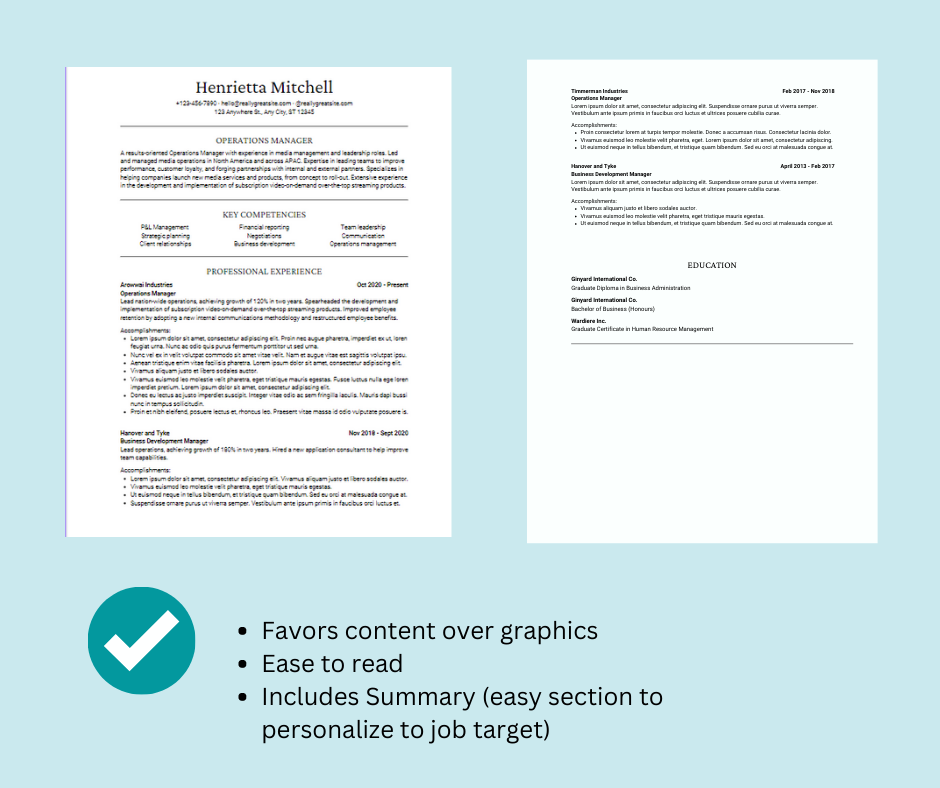
This template (and yes, 2 pages+ is ok) has no columns, no graphics, and includes a summary/intro at the top. This is an ideal space to tie your skills to the target job title.
Resume.IO
Resume.io offers customizable resume templates, both free and paid subscriptions. I reviewed the free templates.
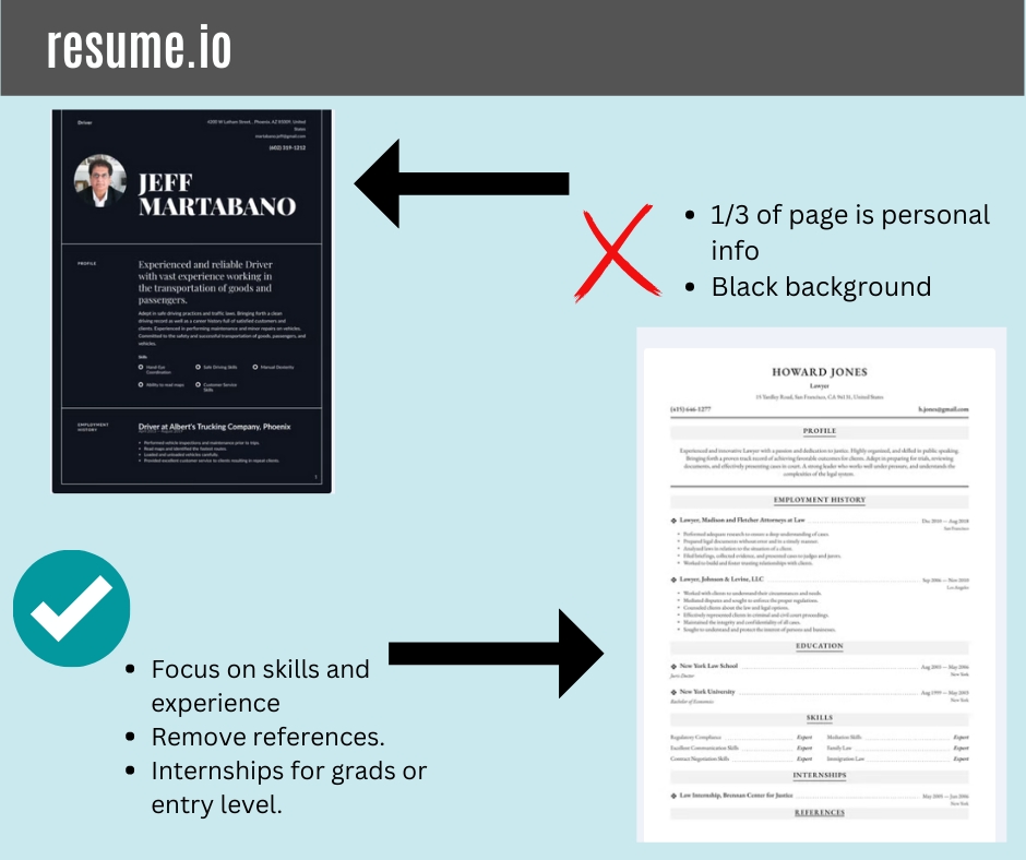
Dark mode has a fan base, but this format choice could cause an issue for hard-copy prints.
My pick is vanilla, but I like the chronological format with the input areas for summary, experience, education and skills. Delete the references (any mention of references is either redundant or not necessary at this step).
Google Docs
Google Docs are accessible (and free)! They are easily customizable and also feature accessibility settings ( like screen reader compatibility or voice typing).
One thing I would recommend: do not send your resume in a URL shared document. Not all recipients will have access to the Google Suite products. More importantly, company firewalls and security may block the link for phishing. Download the document as a file (either PDF or doc).
Teal
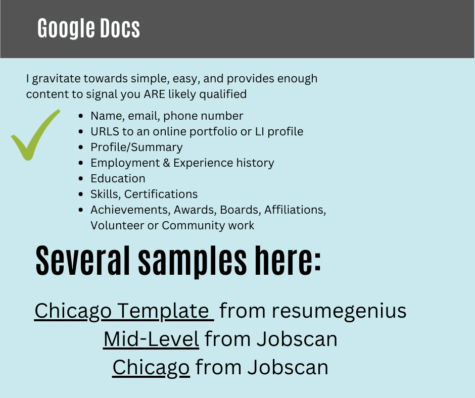
TealHQ provides a plethora of resources for a job seeker, from job trackers to communication tools. This link will provide a foundation of resume samples so you can start building off these ideas. Samples include IT Manager, Brand Strategist, and Customer Service Manager to name a few.
But will it be “ATS-Compliant”?
An ATS (Applicant Tracking System) is the software that companies and recruiters use as a centralized digital system to store, track, and add manual notes for applicants, candidates, and the overall workflow of the recruitment funnel.
There has been a lot of fear-mongering regarding the ATS and if your chosen resume format will be digested properly into the system.
Most modern ATS systems are intuitive and should be able to read text from resumes ( PDFs–again, depending upon the system). I have heard some have issues with text boxes, headers and footers, and columns. If you are uploading a document (PDF or Word/Google) with your application, the recruiter typically has an option to view the document itself in addition to how the text was aggregated.
To get an idea of how Indeed parses your resume, try this tool out.
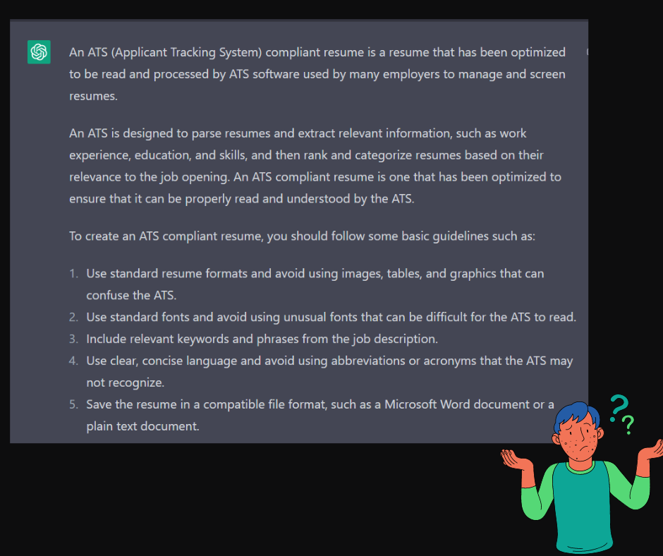
Even ChatGPT isn’t 100% forthcoming. Not all ATS systems rank or parse a resume. Depending upon how the company/recruiter configures the ATS, resume parsing options can be turned off (thus the need for manually adding your information).
Even if an ATS system ranks resumes, a human will still be reviewing and auditing applicants. ATS’ aren’t screening you out…people are.
Unless you are using Wingdings, I am not aware of any ATS that is rejecting a font, italics, bold, or bulletpoints.
Other considerations when using a Template
- Braindump! As I mentioned before, start with content. What are your top achievements? What projects have you been working on in your current role? Have there been challenges along the way…maybe even life lessons you can speak to during an interview? What skills do you possess and want to continue to develop in your career?
- One size doesn’t fit all. If you feel that a particular format represents your qualification and “brand”–go for it. Evaluate the effectiveness and make changes if you aren’t getting the results that you want (and this may not be due to formatting only).
- A template could save you time, but busting out a blank document and writing your resume from scratch is also a great approach to resume creation.
- Ask for feedback from your community and network. Professionals who work in your field, preferably those who hire for your title or skill, can provide insight on suggestions.
What is your process for writing a resume? Do you have a preferred template or series of steps?
